

"On My Way to KITH"
KITH - A five-print self-initiated concept capsule
A five-piece graphic capsule inspired by everyday city visuals and KITH’s store-exclusive spirit — blending streetwear, nostalgia, and storytelling into original apparel graphics that celebrate culture, humor, and urban lifestyle, while reflecting my personal approach to concept-driven, emotionally resonant design.
"ON MY WAY TO KITH"

A Graphic Capsule Inspired by Everyday City Moments
This five-piece concept explores the emotional rhythm and visual texture of daily life in New York and beyond — through the lens of the KITH universe. Whether it’s a subway ride, a deli run, or a midnight soft serve, these graphics reinterpret ordinary urban symbols into playful, collectible streetwear icons. Each design captures a different “stop” on the way to KITH — reflecting city energy, nostalgia, humor, and local culture.


A DAY IN NEW YORK
/ A NIGHT IN BROOKLYN
Concept:
A split-day capsule that contrasts two boroughs, two moods. The daytime version draws from sunny summer visuals — pool water, yellow awning, and cut-out textures — while the Brooklyn version brings cooler tones and a moody shift into the night.

A DAY IN NEW YORK
Design Highlights:
– Cut-and-paste style KITH logo using mixed media textures
– Background split between striped awnings and pool reflections
– Color-coded by time and place: Manhattan vs Brooklyn
– Typography label: “new york” / “brooklyn” to reinforce local identity

A NIGHT IN BROOKLYN
MOCKUPS


Type: KITH Logo Graphic Set (Front Chest)
Garments: Short-sleeve Tees & Crewneck Sweatshirts.
Print Method: Heat Transfer Printing
KITH OPTICS
Concept:
This concept blends vintage optometry charts with KITH's cultural roots. Inspired by eye exams, the front chest logo mimics a colorblind test with “KITH” hidden inside a dot matrix. The back graphic reimagines a Snellen eye chart using streetwear-coded language and New York references.

FRONT GRAPHIC
Design Highlights:
– Front: Ishihara-inspired dot pattern with tonal KITH lettering
– Back: Vertical type arrangement spelling out “USA / NYC / KITH / CULTURE / BROOKLYN / NOSTALGIA”
– Clean grayscale palette for a clinic-meets-culture aesthetic
– Repeated across multiple base colors for variety

BACK GRAPHIC
MOCKUPS
STREET LEVEL NYC
Concept:
This set pays homage to New York’s everyday infrastructure — turning overlooked urban details into graphic storytelling. The front features a stylized street sign intersection of “1111 St” and “KITH Ave,” while the back showcases a bold yellow fire hydrant plastered with KITH brand stickers and city references.
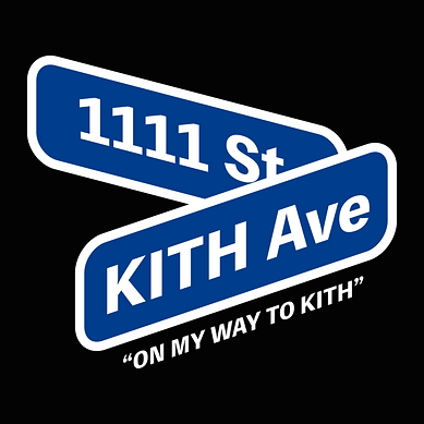
FRONT GRAPHIC
Design Highlights:
– Front: Iconic blue street signage in stacked layout with “ON MY WAY TO KITH”
– Back: Fire hydrant graphic with NYC and Brooklyn callouts
– Sticker layering reflects the visual culture of the street
– Blue and black tees channel utility, movement, and city grit

BACK GRAPHIC
MOCKUPS


Type: Graphic Set (Front Chest & Back)
Garments: Standard Tees & Crewneck Sweatshirts.
Print Method: Heat Transfer Printing
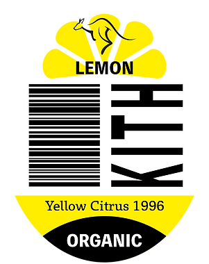
KITH MART
Concept:
A playful twist on everyday errands, this set draws inspiration from corner store fruit stickers and grocery runs. The front graphic features three mini KITH-branded fruit stickers — a nod to supermarket nostalgia. On the back, a taped-up black shopping basket with “No Membership Required” repositions KITH as stylishly accessible.
Design Highlights:
– Front: Banana, lemon, and tomato “KITH Mart” stickers in layered layout
– Back: Basket taped in true bodega fashion, emphasizing irony and familiarity
– “No Membership Required” turns exclusivity on its head
– Subtle humor with a refined visual edge
FRONT GRAPHICS: KITH'S FRUIT STICKERS


BACK GRAPHIC: KITH'S TAPED BASKET

MOCKUPS


Type: Graphic Set (Front Chest & Back)
Garments: Standard Tees & Crewneck Sweatshirts.
Print Method: Heat Transfer Printing
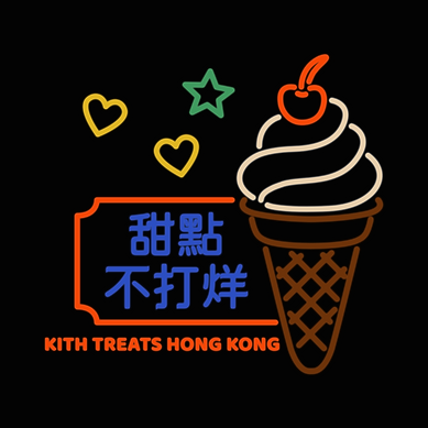
KITH TREATS HONG KONG
- AFTER HOURS EDITION
Concept:
Designed for a KITH Treats pop-up in Hong Kong, this set captures the vibrant dessert culture and neon-lit nightlife of the city. The front graphic features a glowing sundae with the “OPEN” sign, while the back channels a local dessert shop aesthetic, complete with 甜點不打烊 ("dessert never closes") in glowing blue characters.
Design Highlights:
– Front: Ice cream in a paper cup with bold “OPEN” lettering
– Back: Neon signage with stars and hearts, plus an oversized cone with a cherry on top
– Typography: Chinese characters 甜點不打烊 for authentic local flavor

FRONT GRAPHIC
BACK GRAPHIC
MOCKUPS


Type: Graphic Set (Front Chest & Back)
Garments: Standard Tees & Crewneck Sweatshirts.
Print Method: Heat Transfer Printing
GRAPHIC TEES OVERVIEW


NOTE FROM THE DESIGNER
"ON MY WAY TO KITH" is a self-initiated project that explores how everyday visuals — from city signage to supermarket stickers — can become elevated, wearable stories. Each graphic is a reflection of my personal design philosophy: to find meaning in the mundane, to balance playfulness with polish, and to always speak through visuals first.
This capsule blends cultural cues, humor, and local detail into a cohesive graphic language that aligns with KITH’s lifestyle-driven aesthetic. From New York’s daily rhythm to a special moment in Hong Kong, this project imagines how streetwear can connect cities, symbols, and stories through graphic design.
KAI-CHEN WU | DESIGNER


Type: Graphic Set (Front Chest & Back)
Garments: Pocket Tees, Standard Tees & Crewneck Sweatshirts.
Print Method: Screen Printing or DTG Printing